


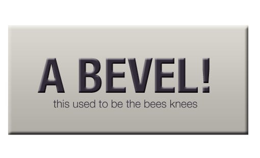
 Remember when bevel, gloss and drop shadow were three required effects for your design to succeed ?
I do. It used to be really cool to get that semi-realistic effect on your font or buttons. It was the prime example of a graphical environment and people really digged it.
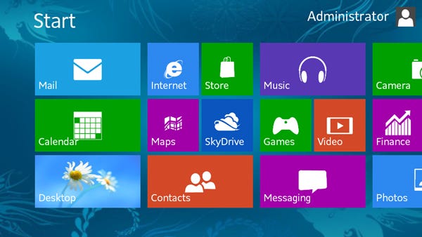
However, that came to an end last year, when a new trend won the popularity contest — flat design. It’s everywhere — on websites, infographics, illustrations, application UI’s. I’m waiting for the moment it goes into games as well, if it’s not already and I’ve missed it.
What is flat design ?
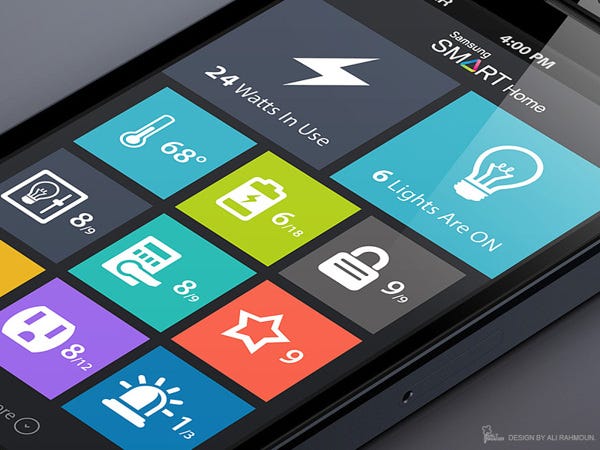
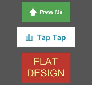
It’s an uprising design trend in 2013. It’s main focus is to use simple shapes and flat colours to create a user interface or a visual environment for a website or application. It tries to represent visual information in the most simple and easy to digest way possible. That means no 3D, no textures, limited shadows, gradients, patterns and other visual effects.
A website is no longer a page of text on the Internet. Now it has multimedia, tools, widgets, various buttons for various actions. All this bogs down the user and complicates his experience with the product.
The 21st century is one of fast living and no time to spare. If you want to fit within the 24/7 time frame you have to be efficient and fast and that applies to every aspect of our life. From the news website we go through with our morning coffee, to the weather application on our smartphone. Visual graphics play a strong role in here. They can either distract you from the prime reason you do what you do, or they can guide you and improve your experience.
Ten years from now, we enjoyed blinking icons, flashy menus and cool transition animations. But today, they only slow us down and distract us from what’s really important. For example, you visit a blog with the intention to read a post or two. In that case flashy graphics will take you away from that prime reason and only waste your time. And since wasting time is a taboo in today’s world, those graphics no longer apply.
A commercial website, offering you services or products will want you to look at their catalogue or service descriptions, no their fantastic navigation bar. Keep the graphics light, let the eye focus on that booking form.

Another consideration is that graphics are no longer as fascinating as they used to be. As a graphics artist (sort of, I'm learning to be one)I can give you countless examples of complete photorealism created from scrap entirely digitally. With that said, if we can imitate life to absolute perfection, there is no bigger milestone we can conquer. Graphics simply can’t surprise us anymore and if they are in the way, then all the better reason to strip them down and allow the more important factors to play, like content.
Note that this example doesn't take in consideration the quality of content you are consuming.
So, where does flat design fit in here?
Everywhere. Flat websites are brilliant for the purposes of presenting fast and easy to digest content to the users. And take in consideration that it’s only a visual aesthetic.
A lot of people confuse flat with minimalist and while they might look similar, they’re quite different in purpose. Minimalist is to strip something to the very bone, with just the minimal functionality to serve it’s purpose.
You might say notepad is a minimalist text editor. It allows you to type and edit text — that’s it. However, Microsoft Office 2013 allows you to integrate all kinds of media and formatting to your text. From colours, to layouts, to graphics. It holds all the power of it’s predecessor and even more. The difference is, it’s visual theme is no longer bogging you down and distracting you from what’s really important — editing the content.
This reboot from realistic (skeumorphic) design to flat is new and fresh. That’s why the theme is now perceived as modern by the users. This looks now brings the notion of advancement, even though it’s the exact opposite in therms of the technology needed to create it.
And the fact that it’s simple and clean leaves a feel of honesty into the product. To elaborate, you are not trying to hide any flaws behind impressive graphics. You rather let your content speak for itself, while the graphical environment is there to hold everything together.
 Well, as every train has its passengers, flat is not meant for everyone and you can’t expect it to compensate for something else on your website, or to immediately solve your design problems.
In the end, flat is here to stay in my own opinion at least through 2014.
Edit from 2015: I have now learned much more about web design than is shown and written in this article. I'm only reposting it, so I can do a follow up piece soon. If you liked it, stay tuned. Audrey, out.
No comments:
Post a Comment